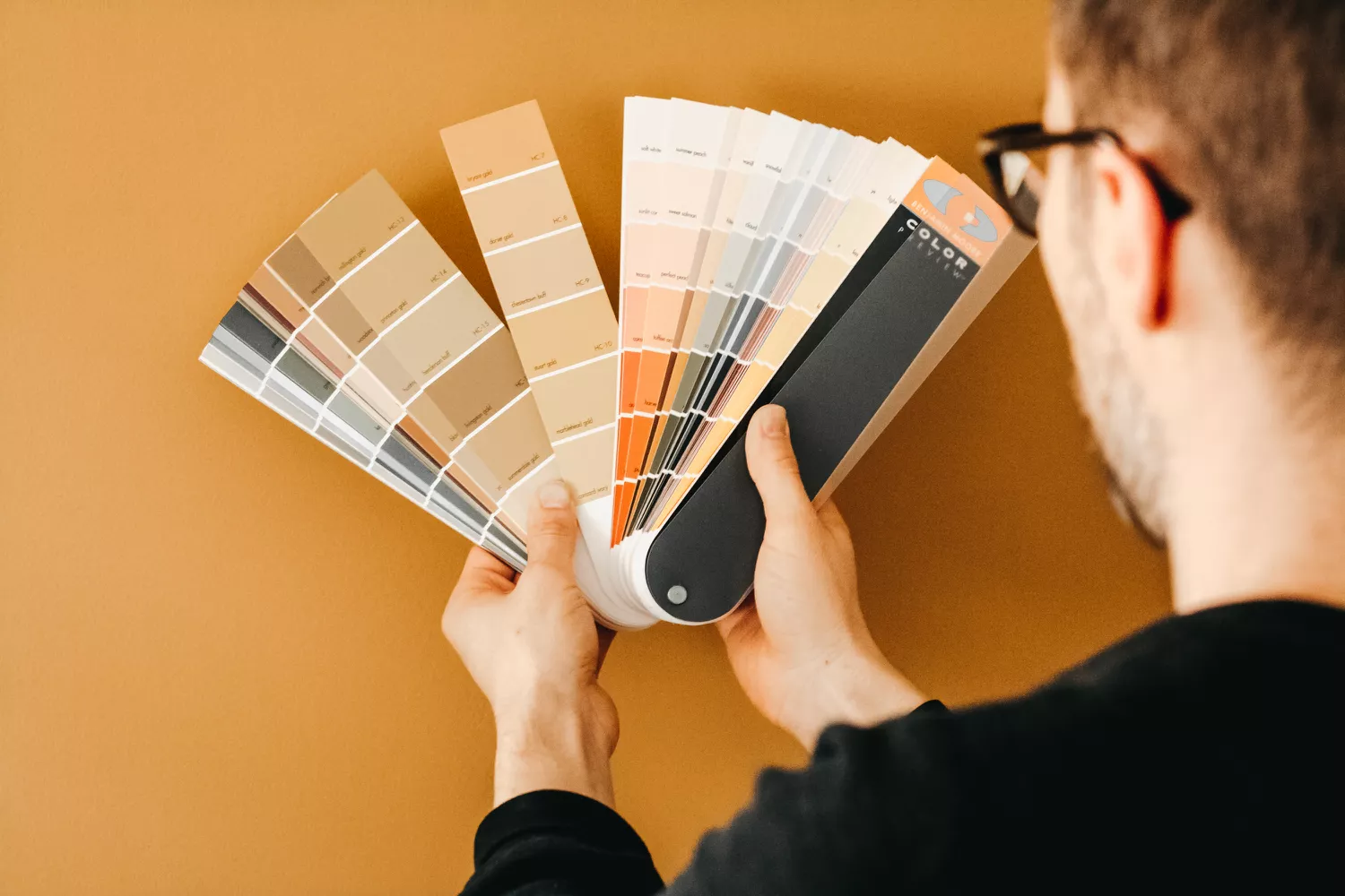
Choosing the Right Interior Color Palette for Every Room
Walk into any home and you feel its colors before you notice anything else. Color is the most powerful — and most personal — tool in interior design. It shapes mood, alters the sense of space, and quietly ties your whole home together. Yet it's also the decision homeowners agonize over most. Here's how our design team approaches color, room by room.
Start With How You Want to Feel
Before browsing paint chips, ask a simpler question: what should this room feel like? Bedrooms usually call for calm and restfulness, kitchens for warmth and appetite, home offices for focus, and living rooms for welcoming conversation. Once the feeling is clear, the color family often reveals itself — soft blues and greens for serenity, warm terracottas and creams for comfort, deep charcoals and forest tones for grounded sophistication.
Build a Whole-Home Foundation First
Rooms should relate to one another, especially in open-plan homes. We typically begin with a neutral foundation — a warm white, soft greige, or muted taupe — that flows through hallways and shared sightlines. Layer accent colors on top of that foundation so each room has personality without the home feeling like a patchwork. Carry one repeating accent through the house, perhaps in textiles or artwork, to create a subtle thread that connects the spaces.
Room-by-Room Guidance
Living Rooms
The living room sets the tone for guests and family evenings alike. Warm neutrals with a richer accent wall work beautifully, as do deep greens or navy paired with natural wood tones. If your furniture is bold, let the walls recede; if your sofa is neutral, the walls can carry the character.
Kitchens
Kitchens thrive on warmth and light. Creamy whites, soft yellows, and sage greens keep the space feeling fresh, while two-tone cabinetry — lighter uppers with deeper lowers — adds dimension without overwhelming the room.
Bedrooms
Choose restful, low-stimulus colors: dusty blues, gentle lavenders, warm grays and earthy clays. Matte finishes help soften light in the evening, and painting the ceiling a shade lighter than the walls adds an airy lift.
Bathrooms
Bathrooms are the perfect place for a little courage. Jewel tones, deep teal, or warm plaster finishes paired with brass fixtures create a spa-like retreat, while crisp whites with textured tile keep small bathrooms feeling open.
Mistakes to Avoid
- Choosing colors from a screen instead of physical samples in the room's real light.
- Ignoring undertones — a "gray" with blue undertones can clash with warm beige furnishings.
- Painting every room a different bold color, which fragments the flow of the home.
- Forgetting the ceiling, trim and doors — these frames shape how wall color is perceived.
- Skipping sheen planning: eggshell and matte hide imperfections, while satin and semi-gloss suit trim and moisture-prone rooms.
Bring It All Together
A confident palette balances dominance, secondary tones and accents — mostly one anchoring color, supported by a complementary shade, and energized by small pops of contrast. When in doubt, nature is the best reference: stone, wood, foliage and sky have been harmonizing long before paint existed.
If you'd love a palette designed around your home's light, your furniture and your lifestyle, our interior team at Refresh Home Decors would be delighted to help. Request a free design consultation and let's find your home's perfect colors together.